6 Social Media Design Mistakes to Avoid
Social media has gone from its humble beginnings as a place to tell your friends mundane details of your day to a full-featured advertising wonderland. Good advertising requires good design, and while we always recommend the trained eye and skillset of professional Social Media Management, here are some common mistakes the uninitiated will want to avoid.
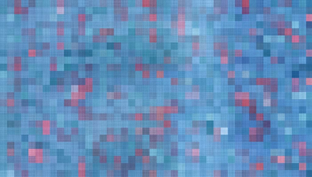
Blurry Images
If your image file is too small and has to stretch, this can result in poor image quality and pixilation. Unfortunately, pixelated images tend to make your brand look unprofessional and are much less likely to be shared. It is always better to upload a larger, hi-res image than a small one. Shrinking is easier than stretching!
Hard-to-Read Fonts
It can be tempting to choose the prettiest font in your collection, but pretty is not always the best choice for social media. Your followers are browsing quickly, and they need typography that is clear and easy to read. You have limited time to get your message across, so make it count.
Poor Color Choice
The colors you choose for your social media designs should reflect the style of your business. While your base colors for your branding should evoke the right feelings, you should also be aware of how they appear on the screen. Ask yourself some questions. Are the colors easy on the eyes? Do they work well together? Are the colors consistent with your brand?
Limiting Viewing Options
When posting to social media, you need to know your audience. How are they viewing your content? Your image might look great on a desktop computer, but does it look as good on a smartphone? Keep in mind that your post might not be a one-size-fits-all solution that will work equally well across all platforms. Your audience may vary, and the style of content should be adapted.
Stock Photos
When it comes to social media, authentic and genuine content is the key to success. Your followers want to see the voice behind your brand. You can do this by taking your own photos. This is not to say that you can’t ever use stock photos. Just make sure you include eye-catching images with personality that match your brand.
Overfilling the Space
Graphic designers understand that less can be more. Negative space is the area that surrounds the objects and text in your images. The background is just as important as your words and imagery. A common mistake is to fill up the entire graphic with letters and shapes. This can look cluttered and can confuse your followers. Whether it’s your logo, header, or a post, try embracing space.
Let GMS plan, implement and maintain a Social Media Management strategy specific to your industry
and location, to increase your online reach with a positive digital reputation. Contact us to learn more about our social media management services.